PROJECT: THE HARDWOOD PRESERVATIONIST

My personal thoughts: There are two directions to go at this point.
Direction One:
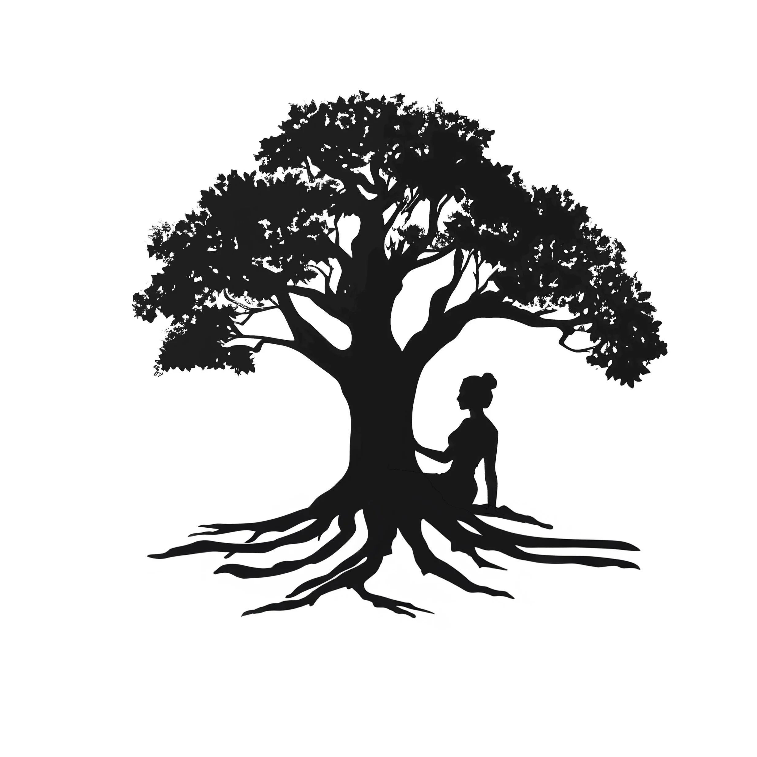
Continue with this design of the woman with her arms growing into the oak tree above her.
Height:
Remember that this particular design is very tall compared to most logo designs that are usually more square, circular, or even a horizontal rectangle in overall shape, which translates better to business cards and even on a website.
Typography:
If we proceed with this current design, I personally would move the typography aspect of this logo into the tree portion of the design to help reduce its height.
I also don’t feel like this font matches the style of the logo. What do you think?
Roots:
Also, to help the height, I would also merge the roots into the bottom of the woman or remove the roots that are currently there and do something simpler (better matching stylistically) from the woman’s body flowing into roots.
Direction Two:
Here’s a (rough draft) of a different concept that I couldn’t seem to get out of my mind.
This emphasizes your brand’s dedication to caring for hardwood and honoring its natural origins. It highlights your commitment to preserving the beauty and longevity of wood, reflecting a holistic approach that respects nature. I believe separating the woman from the tree helps show the nurturing aspect of your business.